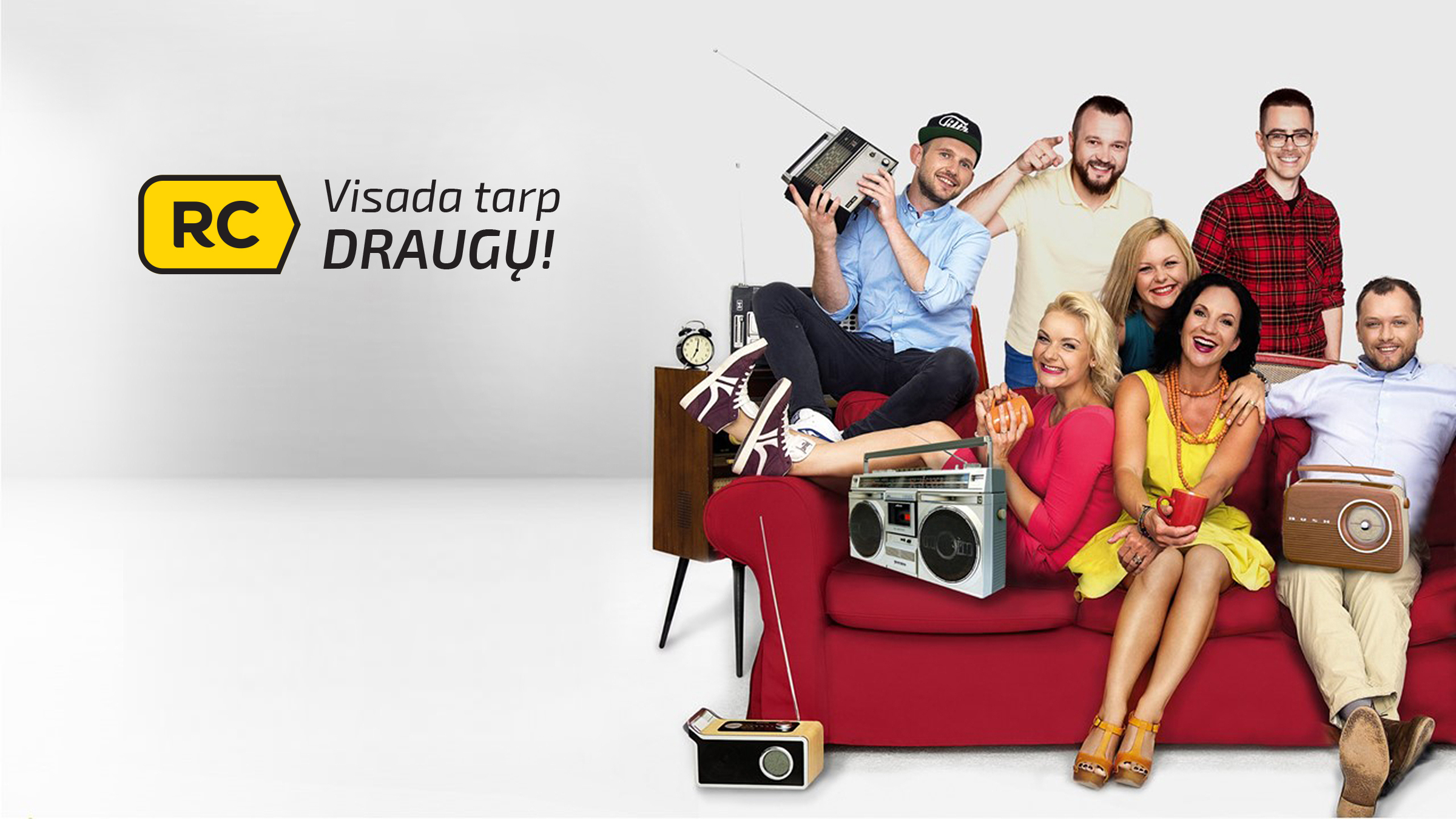
Poster

Logo version „Frequency“

"Flat" logo facelift
Add
25 years anniversary logo
The task was to update the logo of one of the largest radio stations in Lithuania. Due to changes in terms of use and convenience (for example, a mobile app), it was decided to shorten the title to a two-letter abbreviation. The icon of the virtual button, emphasizing the musical side of the radio station, with one of its ends made like PLAY sign was chosen as a symbol. Today, the logo is used in a slightly different style than was used at the beginning - according to the graphics "flattening fashion" after a few years the 3D style button was replaced with 2D one. The logo in everyday life is flexibly adaptable to various additional slogans and themes. Website: rc.lt